Anatomy Now
Overview
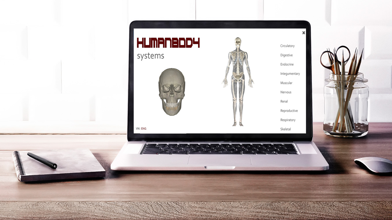
Anatomy Now is an application developed by the Center of Visualization and Simulation (CVS) at Duy Tan University in Da Nang, Vietnam. The application models human body systems and organs to help students learn anatomy and spans across three platforms: desktop, mobile, and virtual reality.
I joined the CVS team as a UX research and design intern during the summer of 2018 as they were preparing to present at the RISE startup conference in Hong Kong. My team was tasked with conducting a heuristic evaluation of an existing desktop interface and creating prototypes for the redesigned interface.
Front-end Analysis
User Analysis
My team and I identified who the target audience or this product was; who would be using it, the manner that they would be using it, and what tasks they would need to be able to accomplish. We generated user personas to capture the characteristics, goals, experience, wants, wishes, needs, and frustrations of our target audience.
Evaluation
Identifying problem areas
After functional and task analysis of the interface through observation and self-trial was conducted, my team identified problem areas to focus on for our re-design. We focused on the menu and navigation for the main screen and the secondary screen where users can interact and learn detailed information about a particular system.
For the main screen:

- Poor use of screen space
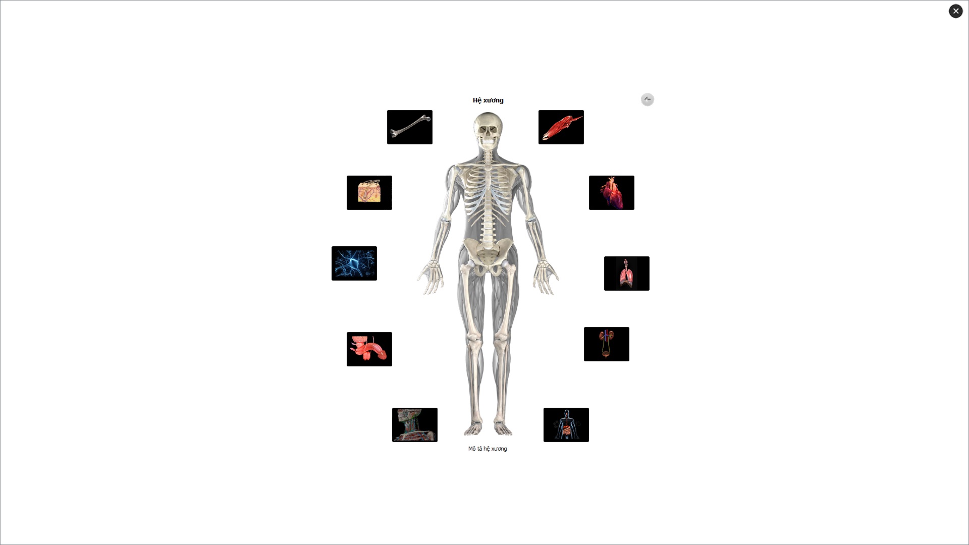
On the original design, there was a large amount of whitespace that was unused on the screen. The radial menu was compact, making text and images illegible.
- Poor labeling of systems and subsystems
Systems were identified by icons and dynamic text at the top of the menu. This requires a user to have previous knowledge of a body system to select it without hovering over each icon. The images are small and unclear.
- Placement and inconsistency of "exit" and "back" buttons.
The 'x' to close out the system is located in the right upper corner of the screen. If a user returns to the main menu screen after looking at a specific body system, they are unable to close out the program using this 'x'. Additionally, the arrow to return to the previous menu screen is located on the upper right of the radial menu, giving users a conflicting conceptual model of how to navigate between menus.
Solution:
The first iteration:
- Buttons to access submenus were enlarged in adherence with Fitt's Law.
- Labels were added to body systems to reduce cognitive load of the user and reliance on recall.
Second iteration
- Menu selections were placed on the right side of the screen to make use of the infinite edge in compliance with Fitt's Law.
- On main menu, images clearly refinforced topic of menu selection when hovering, providing the user good information about the state of the system
For the screen specific to body systems:
- Poor error recovery
- An overwhelming amount of buttons each with individual functions.
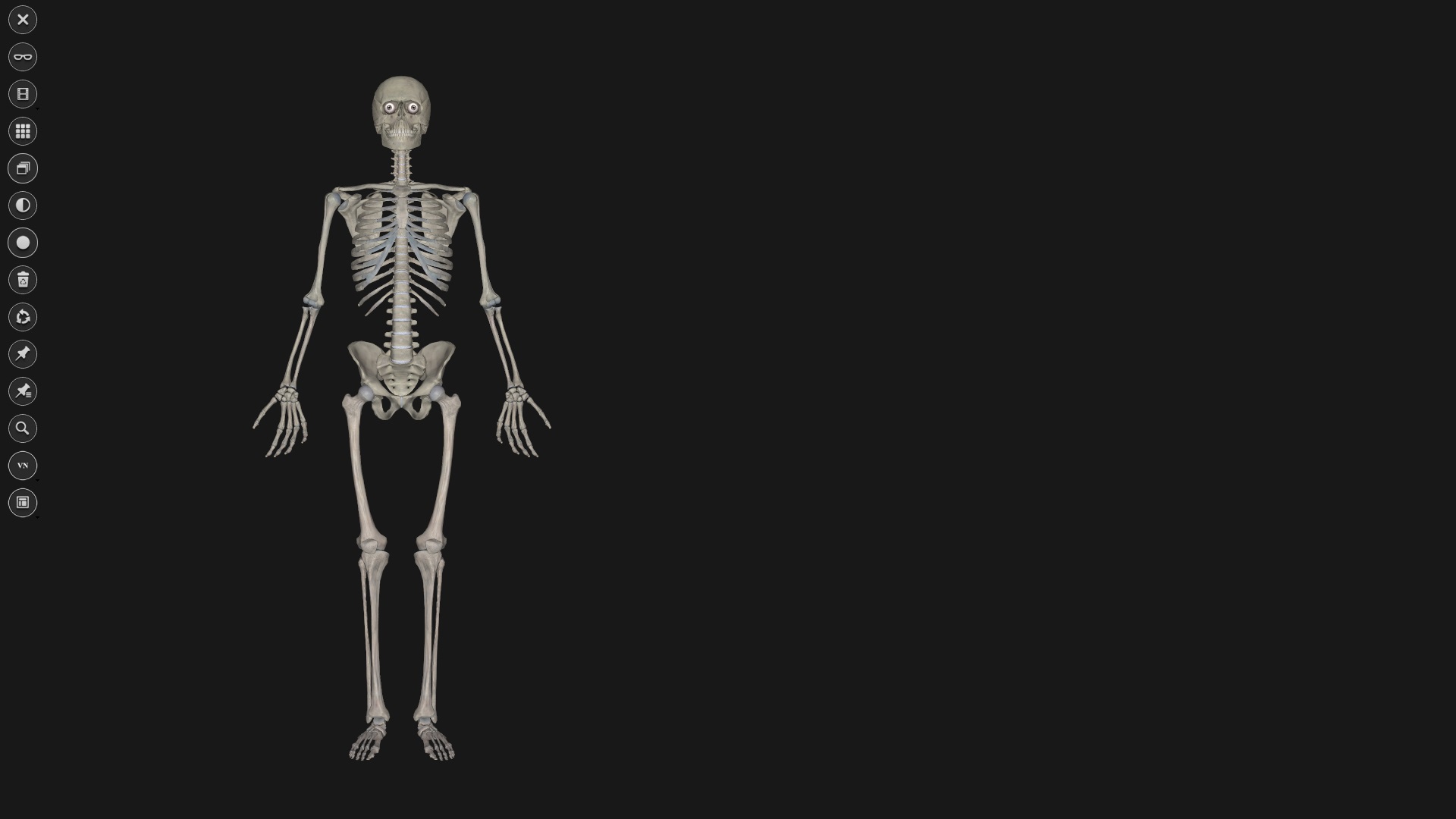
For screen specific to body systems:

.jpg)
- Entire application frequently closed in error.
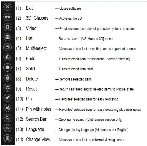
The vertical menu was placed along the left edge of the screen. When a user selected the top most button 'X', the entire application closed. This was inconsistent with the main menu layout, and caused a mismatch in a users conceptual model. The correct selection to return to the previous screen was located four icons below this and had a 3x3 grid layout, which does not reflect the layout of the main menu.
- An overwhelming amount of buttons each with individual functions.

There were 14 buttons, each with different functions. These buttons were difficult to distinguish and decreased learnability for a novice user.
- Poor error recovery
If a user deleted an item, they were unable to undo this action without resetting the image.
Solution:
- Option to exit system was removed from this screen and implemented only in the main menu.
- Back arrow was implemented to return to previous screen instead of icon.
- An undo option was implemented to aid in error recovery.
- The 14 functions were condensed into nine main functions and grouped by similar tasks.
User Testing
User testing is currently being carried out on the redesigned interface. The following metrics will be uses:
My Role
Over the course of the project, I was individually responsible for:
- Heuristic evaluation of the original interfacce
- Sketches and wireframes
- Creation of mid-fidelity prototype of redesign
Summary
This project was a great opportunity to work with developers in the early stages of product development. It was easy to get caught up in the scope of the project, but ultimately it was important to focus on navigation and reducing crucial errors for users.